
Here we are with another experiment and another lesson for anyone who wants to improve their website’s conversion rate.
This time, we worked with a client whose landing page had a 10% conversion rate. At first glance, that’s not bad, especially given the scale of their advertising. But we knew they could do better.
Quick Takeaways
- We tested a relatability section in two placements: after the first CTA and right before the final CTA.
- With 15,244 participants over five days, Test Group 2 improved form submissions by 4.1% and webinar joining by 4.66% compared with the control.
- The bottom placement won, suggesting visitors benefited from exploring the offer before seeing the reminder that it was built for them.
- The primary-metric improvement was not massive, but the secondary metric showed more promise.
The page already had most of the “must-have” conversion elements:
- A/B-tested headlines and subheadlines for impact
- Clear CTAs (calls to action)
- Testimonials for trust
- About Us and About the Webinar sections for context
All these had been tested and optimized to their best version. So, the question became: What do you do when there’s nothing obvious left to “fix”? You add something new
Our Hypothesis: It’s About Relatability
At the risk of stating the obvious: offers with high conversion rates feel deeply relatable to their audience.
People need to see themselves in what you’re offering. They need to feel that this product or service was made for them; that you “get” them. And they need that reassurance before they ever purchase or sign up.
So, we asked: “How do we make this landing page feel more relatable?”
Our answer: Add a “Do these sound familiar?” section that lists the most common struggles our audience faces. This would be paired with an empathetic statement: “If these sound familiar, you’re not alone and this offer was built for you.”
This does two things:
- It reassures visitors that we understand their pain.
- It creates a stronger emotional connection to the offer.
Building It the Right Way: Data-Driven Copy
We didn’t want to guess what those struggles were. Assumptions lead to fluffy, generic copy, and that’s the last thing we wanted.
Instead, we used a data-driven approach.
Using a secure OpenAI API, we analyzed historical application forms where people had answered open-ended questions like:
- “What are you struggling with right now?”
- “What’s holding you back?”
From this, we pulled out the top 4 most frequently mentioned issues and turned them into short, impactful statements.
We then transformed these insights into visual graphic cards, each representing one of the top struggles. These were grouped in a new section with a short statement, essentially saying:
“If these challenges feel familiar, this offer is made for you.”
But Where Should It Go?
Placement can make or break a section like this. So we created two versions:
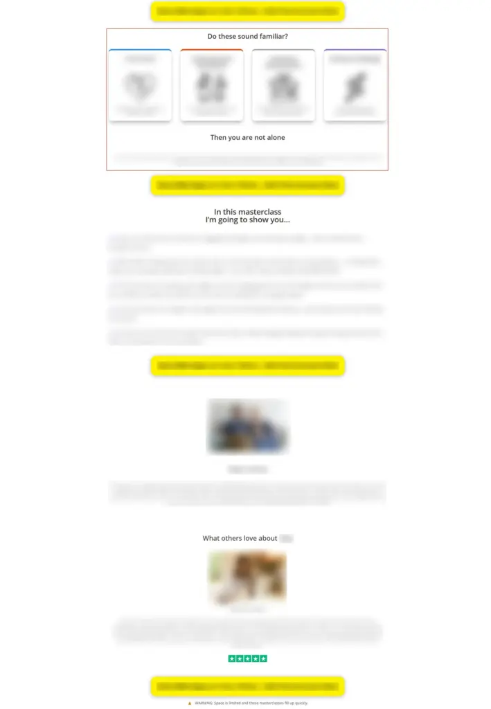
Test Group 1: Section placed right after the first CTA (near the top of the page).
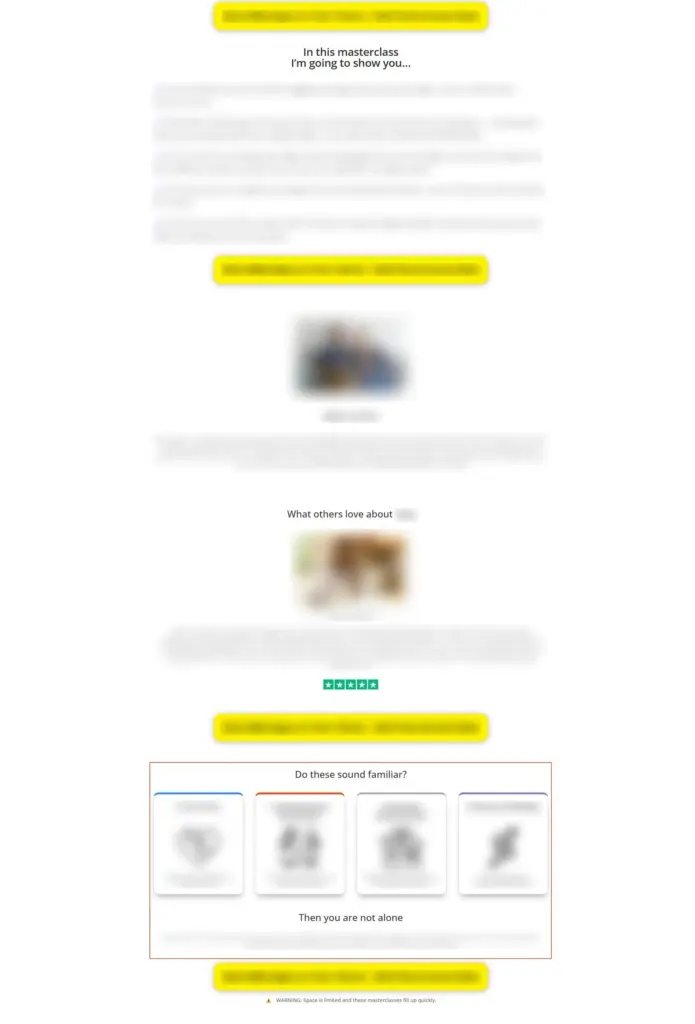
Test Group 2: Section placed at the very end of the page, right before the final CTA.
Results
Over 15,244 people participated in this experiment over five days.
Here’s what we found:
- Form submission rate: +4.1% improvement for Test Group 2 compared to control.
- Control: 18.00%
- Test Group 2: 18.74%
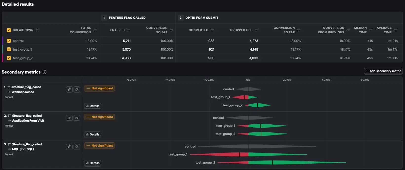
- Webinar joining rate (secondary metric): +4.66% improvement for Test Group 2 compared to control.
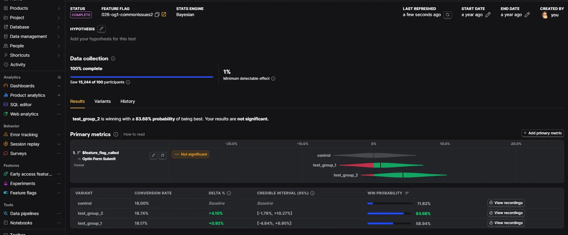
While the primary metric improvement wasn’t massive, the secondary metric showed even more promise. Taken together, this was enough to declare Test Group 2 (bottom placement) the winner.
How Did This Work?
The lesson here is simple: Relatability converts.
By mirroring our audience’s exact struggles back to them, we made the page feel like it was written just for them. That recognition built trust and trust drives action.
In other words, even though our primary metric, form submission rate, didn’t show a significant improvement, our secondary metric, application form visits, saw a massive increase compared to the control. This tells us that those who did submit the form in test groups 1 and 2 were more engaged and more willing to take the next steps.
And importantly, placement mattered. In this case, adding the section near the end of the page (right before the final CTA) performed better than placing it near the top. It gave visitors time to explore the offer first, and then hit them with a “this is for you” reminder at the exact moment they were considering their next step.
Key Takeaways
- Understand before you optimize.
Don’t guess what your audience struggles with, use their own words. - Relatability builds trust.
When people see their exact pain points reflected, they feel understood. - Monitor all your metrics.
Sometimes the primary metric won’t tell the whole story. Digging into secondary metrics can reveal surprising and valuable insights. - Test placement, not just content.
Even a powerful section can underperform if it’s in the wrong spot. - Execution matters.
CRO isn’t just about knowing the principles; it’s about executing them in the right order, with precision.

Final Thoughts
Sometimes when you review a page with poor results, you hit a dead end: “We did nothing wrong. Why isn’t it working?”
The problem isn’t always what you did; it’s what you didn’t do.
In this case, the missing piece was a relatability-focused section that directly addressed our audience’s pain. Adding it made the difference.
This is what years of experience in CRO teaches you: seeing the gaps others miss, and knowing exactly what to test.
Frequently asked questions
What is a relatability section on a landing page?
It is a section that reflects recognizable audience problems back to the visitor and connects them to the offer. In this experiment, four common struggles were paired with an empathetic message that the visitor was not alone and that the offer had been built with those problems in mind.
How do you write relatable copy without relying on guesses?
Start with first-party language from interviews, sales calls, surveys, support conversations, reviews, or open-ended application responses. Group recurring problems, preserve the audience’s natural vocabulary, remove personally identifying details, and validate that the final statements are both common and relevant to the offer.
Where should a relatability section appear?
In this test, placement immediately before the final call to action outperformed placement near the top of the page. That is a useful hypothesis for similar pages, not a universal rule: the right position depends on whether visitors need to understand the offer before the recognition message becomes persuasive.
What results did the bottom placement produce?
Among 15,244 participants over five days, its form-submission rate was 18.74% versus 18.00% for the control—a 0.74 percentage-point increase, reported as a 4.1% relative lift. The article also reports a 4.66% improvement in its downstream webinar-joining metric.
Was the relatability test conclusive?
No. The primary form-submission result was modest and did not reach the article’s significance threshold; the displayed win probability was 83.68%. The combined direction of the primary and secondary metrics made the bottom placement promising, but replication would provide stronger evidence than treating one directional result as a general law.
Why might the bottom placement have worked better?
Visitors first had time to learn what the webinar offered, then saw their own problems reflected immediately before deciding whether to act. That sequence can make the recognition message feel like relevant confirmation rather than an unsupported claim at the beginning of the page.
What makes a strong relatability statement?
Use specific situations the intended audience genuinely recognizes, not broad claims that could describe anyone. The statement should acknowledge the problem without exaggerating it, make a credible bridge to the offer, and avoid promising that recognition alone proves the solution will work.
What should a follow-up relatability experiment test?
Replicate the bottom placement against the control first, then isolate one element at a time: the selected problems, their wording, the visual treatment, or the empathetic bridge. Continue measuring downstream behavior and lead quality so stronger clicks or submissions do not conceal weaker customers.
If you’re wondering whether your pages have hidden opportunities like this, let’s talk.
Click the “Let’s chat” button and schedule a call.
We’ll do the hard work for you and help you get the maximum return on your efforts.
If you’re running a test on WordPress, Shopify, or ClickFunnels, you can access a step-by-step guide tailored to your platform. Just click to get started: [WordPress, Shopify, ClickFunnels].